Standard Suite (v1) Metrics – Usage Examples#
This notebook will demonstrate how to call the specific functions defined in the Standard Suite (v1) Metrics notebook, using a small demonstration dataset.
import pandas as pd
import numpy as np
Sample Data#
sampleData = pd.read_csv(r"../nwm_streamflow/NWM_Benchmark_SampleData.csv", index_col='date').dropna()
print(len(sampleData.index), " Records")
sampleData.head()
12145 Records
| site_no | obs | nwm | nhm | |
|---|---|---|---|---|
| date | ||||
| 1983-10-01 | 1104200 | 1.121347 | 6.175417 | 1.469472 |
| 1983-10-02 | 1104200 | 1.214793 | 6.250417 | 1.848861 |
| 1983-10-03 | 1104200 | 0.872159 | 6.215833 | 2.169456 |
| 1983-10-04 | 1104200 | 0.419089 | 6.105000 | 2.200083 |
| 1983-10-05 | 1104200 | 0.849505 | 5.952500 | 1.931588 |
Import Metric Functions#
The functions are defined in an
Standard Suite (v1) Metrics.
They are imported for use here by running that notebook from within the following cell:
%run ../../Metrics_StdSuite_v1.ipynb
# This brings functions defined in external notebook into this notebook's namespace.
The functions are now available here, to run against our sample data. These are called with two arguments: an array/series of observed values and an array/series of modeled/simulated values.
A couple of examples:
# Mean Square Error
MSE(obs=sampleData['obs'], sim=sampleData['nwm'])
55.73589185136414
# Kling-Gupta efficiency
KGE(obs=sampleData['obs'], sim=sampleData['nwm'])
0.3286282290159971
Create Composite Benchmark#
It is useful to combine several of these metrics into a single benchmark routine, which returns a pandas Series of the assembled metrics.
This example computes those metrics which might apply to the streamflow variable.
def compute_benchmark(df):
    obs = df['obs']
    sim = df['nwm']
    return pd.Series(
        data={
            'NSE': NSE(obs, sim),
            'KGE': KGE(obs, sim),
            'logNSE': logNSE(obs, sim),
            'pbias': pbias(obs, sim),
            'rSD': rSD(obs, sim),
            'pearson': pearson_r(obs, sim),
            'spearman': spearman_r(obs, sim),
            'pBiasFMS': pBiasFMS(obs, sim),
            'pBiasFLV': pBiasFLV(obs, sim),
            'pBiasFHV': pBiasFHV(obs, sim)
        },
        name=df['site_no'][0], # special case -- 'site_no' column
        dtype='float64'
    )
compute_benchmark(sampleData)
/tmp/ipykernel_1543/2205715336.py:17: FutureWarning: Series.__getitem__ treating keys as positions is deprecated. In a future version, integer keys will always be treated as labels (consistent with DataFrame behavior). To access a value by position, use `ser.iloc[pos]`
  name=df['site_no'][0], # special case -- 'site_no' column
NSE          0.002319
KGE          0.328628
logNSE       0.184820
pbias       52.561009
rSD          1.375604
pearson      0.817255
spearman     0.804573
pBiasFMS   -34.136547
pBiasFLV    81.492827
pBiasFHV    32.058168
Name: 1104200, dtype: float64
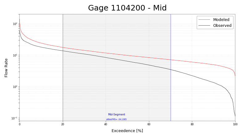
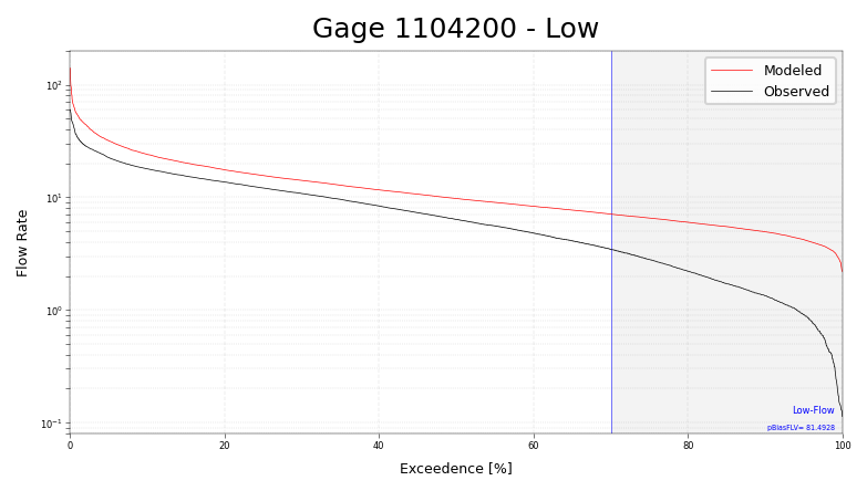
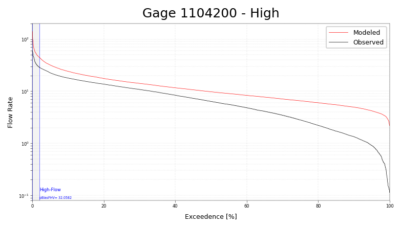
Streamflow and FDC plots#
In the case of streamflow, the NWM standard suite offers a way to plot the Flow Duration Curve when calculating the pBias metrics per Yilmaz et al. This mechanism uses matplotlib to implement the figures.
Some examples:
import matplotlib.pyplot as plt
fig, ax = plt.subplots(1, 1, figsize=(6, 3), dpi=150)
ax = FDCplot(sampleData['obs'], sampleData['nwm'], ax, segment='mid')
ax.set_title("Gage 1104200 - Mid")
plt.show()
# Same fig, but with "segment='lo'"
fig, ax = plt.subplots(1, 1, figsize=(6, 3), dpi=150)
ax = FDCplot(sampleData['obs'], sampleData['nwm'], ax, segment='lo')
ax.set_title("Gage 1104200 - Low")
plt.show()
# Same fig, but with "segment='hi'"
fig, ax = plt.subplots(1, 1, figsize=(6, 3), dpi=150)
ax = FDCplot(sampleData['obs'], sampleData['nwm'], ax, segment='hi')
ax.set_title("Gage 1104200 - High")
plt.show()
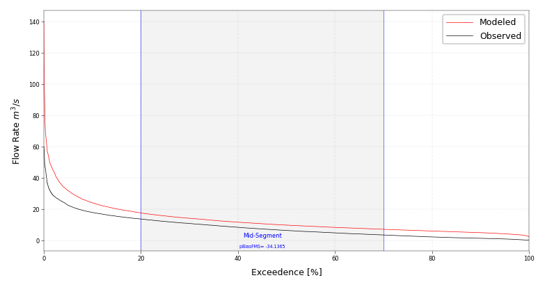
The default behavior is to plot the Y axis log-scale, and to leave units off of the flow rate.
If you would like to manipulate these parameters, you may adjust the ax after calling FDCplot()
(see example, next cell). In general, any of the matplotlib parameters can be adjusted after
FDCplot() in order to customize the figure.
fig, ax = plt.subplots(1, 1, figsize=(6, 3), dpi=150)
ax = FDCplot(sampleData['obs'], sampleData['nwm'], ax, segment='mid')
ax.set_yscale('linear')
ax.set_ylabel("Flow Rate $m^3 / s$") # << labels can contain LaTex-style math between $ chars
plt.show()